MADRID EN CONTRASTE


UNIVERSITY
CEU San Pablo University
TIMEFRAME
Jan - Jun 2021 · 6 months
LOCATION
Madrid, Spain
MY ROLE
City Branding, UX + UI Design, Prototyping, Testing, Benchmarking
TYPE
Two Thesis for Bachelor's Degrees in Digital Comm., Advertising and P.R.
PROJECT
Unlike other global cities, Madrid lacks a cohesive and openly recognizable branding, so I identified this opportunity to merge my two bachelor's degree's thesis, creating "Madrid en Contraste". This project, which is composed of a city branding proposal and a mobile app, aims to improve Madrid's visual recognition, contribute to its digitalization, promote the cultural agenda and increment tourism.
UX/UI
mobile app
UX research
rebranding
brandbook
cum laude
PART I: CITY REBRANDING
REBRANDING: DESIGN TASK
Initial research included two types of analysis: a benchmark of other cities’ brandings and a survey about Madrid’s current perception. Results showed that the majority of the participants, including locals, expats and tourists, do not associate any specific image with the city.
68%
don't have a visual association to Madrid

+200
answers
Ideation process involved several creative concepts sketches and development, until the final proposal was elaborated along with a detailed brandbook, gathering all the style elements, aesthetic specifications and usage guidelines for the correct application of the design.

PROPOSAL: MADRID EN CONTRASTE
The initial letter from the name of the city: The “M” from Madrid and from”madrileños/as”
Triangles: taken from the stars of the Comunidad de Madrid: tradition as base for evolution
Creativity, adaptability, dynamism & accessibility: some of the characteristics of the city

The point where everything confluences: the km 0. Where everything en contraste.
Color contrast & wheel: represents where we come from, what we are and where we are going
Six colors: bright, live, strong and close. Our colors, inspired by the national and regional flag
A part of our history: represented by the typefont of the tiles that name the streets that have seen us grow up
The strategy of “Madrid en Contraste” is based on the respect for the city’s values and history, in contrast to the need of modernization and adaptability. The art direction relies on existing mental associations symbolism, with warm colors and strong inspiration from the Bauhaus school: a functional thinking based on a transformational key visual that ensures recognition, even when the main version changes. This is exactly the concept behind the triangles of “Madrid en Contraste”: the contrast of the transformation from the history & tradition into the future.

BRANDBOOK
It consists of a geometrical icon and a word mark, an regardless of its strong meaning, there is still space to interpretation. This freedom is what will strengthen the connection between the person and the city, bringing Madrid closer to them and making it feel a bit more their own.
Logotype
The palette fills the proposal with vibrancy, personality and meaning. Each of them represents a trait of Madrid, and all of them create a strong contrast among themselves. The red, which is the starting point of the color wheel, pays homage to the Community of Madrid. It seeks to represent the city's roots and is directly related to love, passion, and connection.
Colors
The primary typeface is “Chulapa Bold”, a free and open-source font that Madrid City Council also uses. It is non-geometric and highly recognizable, strongly associated with Madrid’s ceramic tiles that mark the street names. It also has glyphs for certain characters, offering maximum dynamism at the same time as easy mental connection.
The secondary typeface is an open source called Omnes (by Darden Studio). Although application varies with each creative piece, the use is limited to the weights between Thin and Semi-bold for highlights. This fluid font is relaxed and provides visual balance and functionality.
Both typefaces appear together in communications, since they share characteristics aligned with the brand’s attributes, and their combination conveys trust and approachability.
Typeface
It is formed from the key visual. The triangles make up a dynamic, flexible, and adaptable pattern suitable for any format.
Pattern
Just like the icon, it is based on triangles that can be repositioned and rotated in creative ways to recompose into other visual constructions and adapt into new designs. It carries the implicit meaning of taking a part of tradition to build something modern.
Key Visual
The tone of voice is informal and approachable, aiming for a “one-on-one” communication style. All the texts across materials are fun, direct and easy to understand, even including colloquial words and popular idioms. The strategy is to make everyone feel part of Madrid, speaking like a true Madrileño (local).
Verbal Identity


Madriz
Mola mazo
Me flipa
Me rents
Te catas
Garito
Canteo
Pibe
Ir a pachas
Debuti
Delux
Chupa

PART II: APP DESIGN
MADRID APP: DESIGN TASK
The idea was to prototype a smartphone app that gathers useful information about services offered by the Madrid Tourism Department in combination to other informative features.
The app is aimed at both Madrid locals and visitors, since the cultural agenda should be accessible to everybody, but other features might be blocked unless the user is registered.
Work started with an investigation about the current social and digital paradigm in the Spanish capital, strengthened with a market competitors analysis. The prototype was developed in Adobe XD, and it includes all the key screens for each section, as well as example content and interactions to provide the realest testing experience possible. In addition to the walk-through video with voice explanation, a style guide and Component Library were developed to cover all the graphic assets as well as design rules of the proposal.


Project & Design Goals
ACCESSIBILITY
-
Digitalize Madrid Tourism Department's services
-
Habilitate a communication supportive channel
-
Provide a virtual space accessible to everybody
PERCEPTION
-
Improve the perception about Madrid city
-
Propose a potential space for advertising
-
Digitally promote the city rebranding
INFORMATION
-
Centralize all live updated governmental information
-
Increase visibility and discovery of cultural activities
-
Provide a FAQs page with up to date information
User Journey


App Sections
Nearby "Cerca"
It consists of a map that the user can navigate to discover nearby points of interest, including places and events. Results can be sorted and filtered by categories, and are displayed in an expandable format if they want additional information on them
News Feed "Muro"
This section chronologically archives all official announcements by topic, so users can check the latest updates.The format looks like a thread. To improve the experience, there is a keyword system so that information is easier to find
Agenda
A complete list of cultural events can be viewed here either from a calendar view or by using the category grid
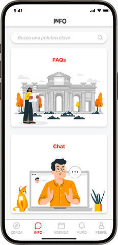
Info
In this portal user can find information via FAQs, or through a live chat
Profile + Settings
Users can manage their accounts and access their favorited elements
Nearby / Home

Agenda

Agenda Detailed View

Info / Support
News Feed

FINAL DESIGN


FINAL REFLECTION
All project goals have been achieved, therefore results are satisfactory.
On one hand, the city branding proposal pays respect to the origins of the city: the essence and the personality of Madrid, a city open to everyone and for everyone, no matter where you are from; while opens the door to a flexible future that adapts and perdures over new times.
On the other hand, the app design has concluded into a functional prototype, based on User-Centered design principles and on the most demanded functionalities. It has been enriched with relevant content, polished with microcopying and supported by a Style Guide.
At an academic level, it has allowed me to apply everything that I have learned in the 5 years of studying my Bachelor’s Degrees in Digital Communication, Advertising and Public Relations. And at a personal level, the projects have had a strong personal interest for me, by proudly contributing to my hometown perception with my design, that hopefully improves people’s lives and adds value to Madrid.


